
In today’s fast-paced business environment, having access to the right data at the right time is crucial for effective decision-making. Enter role-based executive dashboards—a powerful tool that transforms complex data into meaningful insights tailored to specific roles within your organization. Whether you’re a CEO, a department head, or a project manager, a well-designed executive dashboard can streamline information, highlight key performance indicators, and facilitate strategic oversight.
Creating role-based executive dashboards requires a keen understanding of what data matters most to different stakeholders and how to present that data in a clear, actionable format. This guide will walk you through the essential steps to design and implement dashboards that empower executives and teams alike, ensuring they have the right insights to drive performance and achieve organizational goals. Get ready to enhance your decision-making capabilities and elevate your organization’s strategic focus with impactful role-based dashboards.
Let’s dive into the strategies and best practices that will ensure your dashboards are not only functional but also tailored to meet the unique needs of each role within your organization.
❓What is a Role-Based Executive Dashboard❓
A role-based executive dashboard is a data visualization tool customized for specific roles within the executive team. Instead of a generic, all-inclusive dashboard that presents the same data to every leader, role-based dashboards are tailored to highlight metrics and KPIs (Key Performance Indicators) relevant to each executive’s responsibilities. This customization allows leaders to focus on the data that directly influences their decision-making, streamlining operations and aligning strategies across departments.
For example, while a Chief Financial Officer (CFO) might need a dashboard focused on revenue, expenses, and profitability, a Chief Marketing Officer (CMO) might prioritize metrics such as lead generation, customer acquisition cost, and campaign performance.
✅ Benefits of Role-Based Dashboards ✅
✔️ Enhanced Focus: Tailoring dashboards to individual roles allows each executive to focus on the metrics most pertinent to their responsibilities, reducing information overload.
✔️ Improved Decision-Making: Access to relevant, real-time data empowers executives to make quicker, more accurate decisions. Customized views mean less time searching for information and more time analyzing trends.
✔️ Alignment with Organizational Goals: By aligning dashboard metrics with company-wide goals, role-based dashboards ensure that all leaders are working toward shared objectives. Custom metrics for each role allow executives to track progress effectively.
✔️ Greater Accountability: When each role has clear, relevant KPIs displayed, accountability improves. Executives can monitor their performance and adjust strategies as needed.
📚 Key Steps to Create Effective Role-Based Executive Dashboards 📚
Step 1: Identify Dashboard Objectives and Target Users 🎯
The first step is to understand the objective of the dashboard and identify the users. Consider questions like:
👉 Who will be using the dashboard?
👉 What specific goals or challenges does each role have?
👉 What decisions will this dashboard inform?
By answering these questions, you’ll define the purpose of the dashboard and lay the groundwork for selecting relevant metrics and data sources. For instance, a CEO might need a high-level overview of the company’s health, while a CMO requires details on campaign ROI and customer engagement.
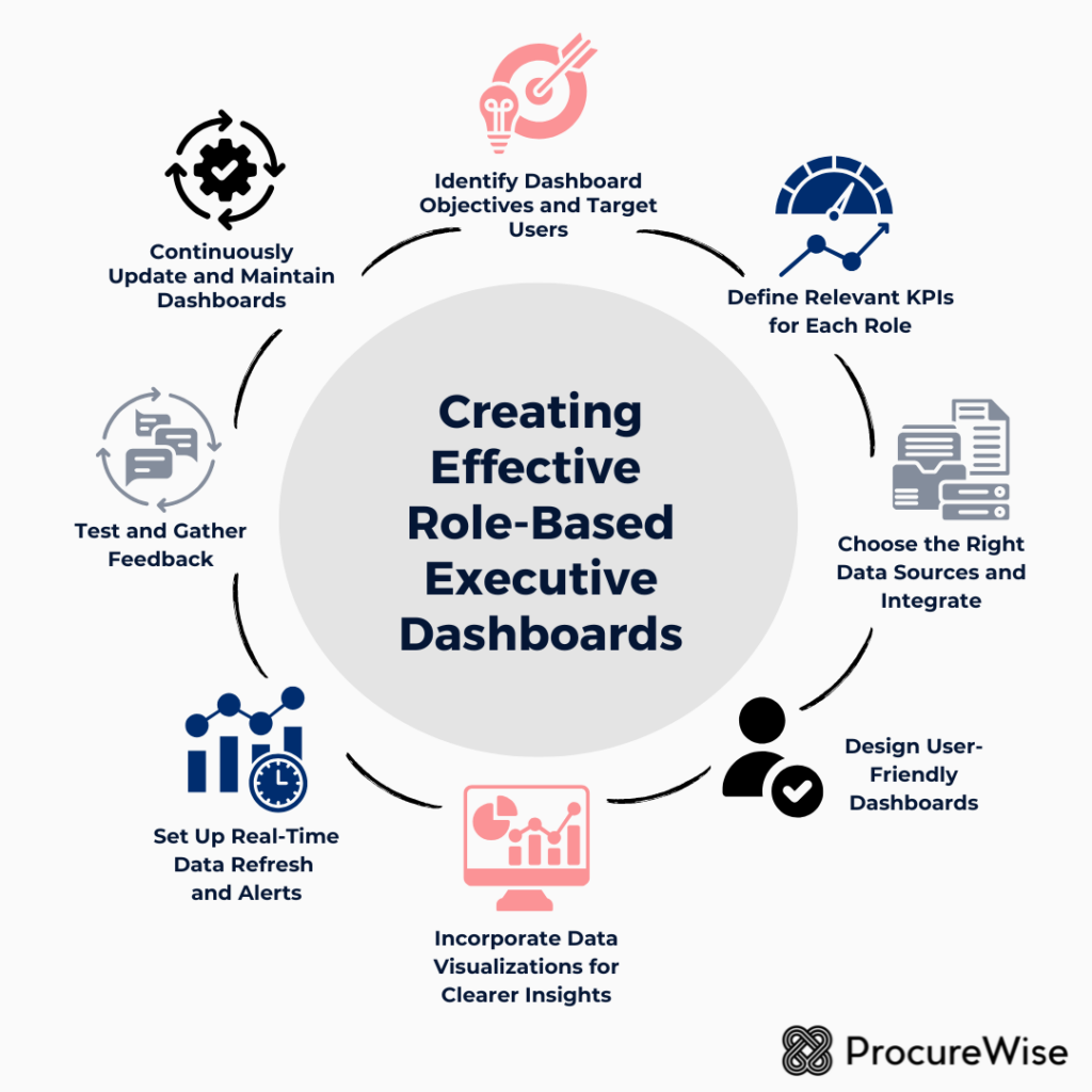
Step 2: Define Relevant KPIs for Each Role ⏱️
A role-based dashboard’s effectiveness depends on selecting the right KPIs. Each KPI should directly relate to the role’s objectives and responsibilities.
Examples of KPIs by Role:
1️⃣ CEO
- Revenue growth rate
- Market share
- Customer satisfaction and NPS (Net Promoter Score)
- Employee engagement
2️⃣ CFO
- Revenue and expense trends
- Cash flow
- Profit margin
- Debt-to-equity ratio
3️⃣ COO
- Operational efficiency metrics
- Supply chain performance
- Production costs and timelines
- Quality control metrics
4️⃣ CMO
- Lead generation
- Customer acquisition cost
- Conversion rates
- Marketing ROI
5️⃣ CHRO
- Employee turnover rate
- Recruitment success metrics
- Employee satisfaction score
- Training and development metrics
Aligning KPIs with strategic goals for each executive ensures that the dashboard remains relevant and actionable.
Step 3: Choose the Right Data Sources and Integrate 🗂️
For a dashboard to provide real-time insights, it must pull data from reliable and up-to-date sources. Integrate data from ERP systems, CRM software, HR platforms, or financial databases to ensure data accuracy and completeness.
Common data sources include:
➡️ ERP Systems (e.g., SAP, Oracle) for operational and financial data
➡️ CRM Tools (e.g., Salesforce) for customer data
➡️ HR Management Software (e.g., Workday) for employee and recruitment data
➡️ Marketing Platforms (e.g., Google Analytics, HubSpot) for campaign performance
Make sure the data integration process is seamless to prevent any lag or inconsistencies in the data displayed on the dashboards.

Step 4: Design User-Friendly Dashboards 🎨
The design of a role-based dashboard is crucial for usability. Dashboards should be intuitive, easy to navigate, and visually appealing.
Key Design Principles:
📌 Simplicity: Avoid overcrowding the dashboard with too many charts or metrics. Focus on the top 5–10 KPIs that each role needs to monitor.
📌 Prioritization of Information: Arrange data so that the most critical information is displayed prominently at the top. Use card layouts or modules to differentiate between sections.
📌 Consistent Color Coding and Labels: Use a consistent color scheme to indicate performance (e.g., green for positive trends, red for negative). Labels should be clear and straightforward to avoid misinterpretation.
📌 Interactive Features: Add filters, drill-down options, or dynamic charts that allow executives to explore the data further without cluttering the main view. For example, a CFO may want to view expenses broken down by department or project.
Step 5: Incorporate Data Visualizations for Clearer Insights 💡
Visualization is key to conveying complex data in an understandable way. Different visualization types serve different purposes, so select the best fit for each KPI.
Visualization Types by KPI:
👉 Line Charts for tracking trends over time, such as revenue growth or employee turnover rate.
👉 Bar Charts for comparing categories, like department-wise expenses or customer acquisition costs by channel.
👉 Pie Charts for showing composition, such as market share or the breakdown of revenue sources.
Gauge Charts to display goal progress, such as hitting quarterly sales targets.
Ensure visualizations are clean, easy to read, and avoid unnecessary embellishments that can distract from the data.
Step 6: Set Up Real-Time Data Refresh and Alerts 🔃
Role-based dashboards are most useful when they reflect real-time or near-real-time data. Set up automated data refreshes to update KPIs regularly, allowing executives to act promptly. Additionally, consider implementing alerts or notifications for when critical thresholds are reached.
For instance:
➡️ A CFO might receive an alert when expenses exceed a certain threshold.
➡️ A CMO could be notified if a campaign’s conversion rate drops below the target level.
➡️ A CHRO might get an alert if employee turnover rises above the acceptable rate.
These real-time notifications enable proactive decision-making, preventing issues from escalating.
Step 7: Test and Gather Feedback 🗣️
Once the dashboards are set up, test them with a small group of users from each role to ensure usability and relevance. Gather feedback on areas like:
📌 Relevance of KPIs: Do the metrics reflect the user’s priorities?
📌 Usability: Is the dashboard easy to navigate?
📌 Clarity of Visualizations: Are the charts easy to understand?
Based on this feedback, refine the dashboard to enhance user experience and effectiveness.
Step 8: Continuously Update and Maintain Dashboards 📊
Role-based executive dashboards are not a “set-it-and-forget-it” solution. As business needs evolve, so too should the dashboards. Regularly review the KPIs, data sources, and visualization design to keep the dashboard aligned with current business goals.
Key areas to update include:
👉 Changing KPIs: If a strategic focus shifts, update the KPIs accordingly.
👉 New Data Sources: Integrate any new tools or data sources as they become relevant.
👉 Feedback from Users: Continue to gather feedback to enhance dashboard relevance and functionality.
🏆 Best Practices for Role-Based Executive Dashboards 🏆
🏅 Align KPIs with Strategic Goals: Ensure each KPI directly supports a broader organizational goal to keep the dashboard relevant.
🏅 Prioritize Real-Time Data: Delayed data can lead to missed opportunities. Prioritize real-time or near-real-time data wherever possible.
🏅 Foster Collaboration Across Departments: Use role-based dashboards to facilitate cross-departmental discussions. For example, if the CFO and CMO see diverging trends in revenue and customer acquisition, they can work together to address the issue.
🏅 Ensure Data Security and Privacy: Only authorized users should have access to specific dashboards, especially for roles involving sensitive data, like finance and HR.
🏅 Iterate Based on Feedback: Dashboards should evolve to meet changing business needs. Regular updates based on feedback keep them effective and user-friendly.
Role-based executive dashboards are invaluable for today’s data-driven leaders. By tailoring these dashboards to specific roles, organizations can empower each executive with the insights they need to make data-informed decisions. Following these steps—defining objectives, selecting KPIs, designing intuitive dashboards, and maintaining relevance through updates—can ensure your role-based dashboards become indispensable tools for guiding organizational strategy.
With these dashboards, executives can not only keep a pulse on their specific areas but also contribute to broader strategic initiatives, ultimately fostering a more aligned, agile, and data-focused organization.