
In today’s data-driven world, creating effective dashboards and reports is paramount for making informed decisions. But with so many tools and options available, how do you ensure that your dashboards meet the specific needs of your team and organization?
Modern dashboards are not just about displaying metrics; they are about delivering actionable insights at a glance. Whether you’re tracking sales performance, monitoring website traffic, or visualizing project progress, the right features can transform your data into a powerful storytelling tool. A well-designed dashboard should be intuitive, visually appealing, and capable of providing real-time data updates to support dynamic decision-making.
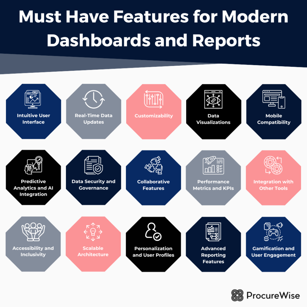
In this guide, we’ll explore the must-have features that every modern dashboard and report should possess to enhance user experience, increase engagement, and drive better business outcomes. From customization options to data integration and interactivity, we’ll delve into the essentials that can take your data visualization to the next level. Let’s get started on the journey to creating dashboards that truly empower your team!
1. Intuitive User Interface (UI) 🖥️
The user interface is the first point of interaction between the user and the dashboard. A cluttered, confusing UI can frustrate users and diminish the tool’s utility. Modern dashboards should prioritize simplicity and clarity, ensuring users can quickly locate and interpret critical information.
Key Elements:
➡️ Minimalistic Design: Avoid overwhelming users with too many visual elements. Use white space strategically to improve readability.
➡️ Consistent Layouts: Maintain a uniform structure across pages or sections for better navigation.
➡️ Tooltips and Annotations: Provide context or explanations for data points without overwhelming the main display.
2. Real-Time Data Updates ⌚
In dynamic industries, such as finance, healthcare, or retail, decisions often hinge on real-time data. Modern dashboards must offer real-time or near-real-time updates to ensure accuracy and relevance.
Benefits:
✔️ Immediate Insights: Teams can act on fresh data without delays
✔️ Error Reduction: Alerts or anomalies can be identified and corrected promptly.
✔️ Improved Decision-Making: Access to the latest data fosters confidence in strategy development.
Implementation Tips:
👉 Use APIs to integrate live data feeds.
👉 Include auto-refresh capabilities with configurable intervals.
👉 Clearly indicate the last updated timestamp for user transparency.
Take advantage of our services for reports and management dashboards now!
3. Customizability 🎨
Every user interacts with dashboards differently, depending on their role, preferences, and goals. Offering customization options ensures that the dashboard meets diverse needs.
Examples of Customizable Features:
📌 Filters: Allow users to drill down into specific datasets based on categories like time, geography, or demographics.
📌 Widgets and Modules: Enable users to rearrange, add, or remove sections based on their preferences.
📌 Themes and Styles: Provide options to switch between light and dark modes or personalize color schemes.
Customizability enhances user satisfaction and adoption by making dashboards more relevant and engaging.
4. Data Visualizations 📊
Data visualizations are the backbone of any modern dashboard. They convert raw numbers into visually digestible formats, helping users uncover patterns and trends quickly.
Essential Visualizations:
➡️ Charts and Graphs: Bar charts, line graphs, and pie charts are standard for comparing values.
➡️ Heatmaps: Useful for identifying density or frequency patterns.
➡️ Geospatial Maps: Ideal for data with geographic components, such as sales by region.
➡️ Interactive Visuals: Enable users to hover over elements for more details or adjust parameters dynamically.
Well-chosen visualizations not only make data more comprehensible but also enhance storytelling.
5. Mobile Compatibility 📱
In a mobile-first world, dashboards and reports should be accessible across devices. Whether users are in the office or on the go, they should be able to access insights seamlessly.
Mobile-Friendly Features:
👉 Responsive Design: Dashboards should automatically adjust to different screen sizes.
👉 Mobile Apps: Offer native applications for Android and iOS for enhanced usability.
👉 Offline Mode: Allow users to download reports or access cached data when connectivity is limited.
Mobile compatibility expands the reach of dashboards, empowering remote and distributed teams.
6. Predictive Analytics and AI Integration 🤖
Modern dashboards go beyond historical data analysis by incorporating predictive analytics and AI-driven insights. These features enable users to anticipate future trends and outcomes.
Examples of AI Features:
📌 Forecasting: Predict sales, demand, or other key metrics based on historical data.
📌 Anomaly Detection: Identify outliers or unusual patterns automatically.
📌 Natural Language Processing (NLP): Allow users to query data using plain language, enhancing accessibility.
AI integration not only boosts analytical capabilities but also democratizes data access for non-technical users.

7. Data Security and Governance 🔒
As dashboards often handle sensitive data, robust security features are essential to prevent breaches and ensure compliance with regulations like GDPR or HIPAA.
Security Measures:
➡️ Role-Based Access Control (RBAC): Restrict access to specific data based on user roles.
➡️ Data Encryption: Protect data in transit and at rest.
➡️ Audit Logs: Track who accessed or modified data and when.
Governance policies ensure data integrity and protect organizations from legal or reputational risks.
8. Collaborative Features 🌟
Dashboards and reports should facilitate teamwork by enabling seamless collaboration. These features help organizations act on insights more effectively.
Collaboration Tools:
👉 Commenting and Annotations: Users can leave notes or mark specific data points for discussion.
👉 Sharing Options: Allow users to share dashboards via email, links, or integrations with tools like Slack or Microsoft Teams.
👉 Version Control: Track changes to reports and revert to earlier versions if needed.
Collaboration tools promote a culture of shared insights and collective decision-making.
9. Performance Metrics and KPIs 📋
Dashboards should prominently display key performance indicators (KPIs) to help users monitor goals and track progress. The inclusion of performance metrics ensures that data aligns with strategic objectives.
Examples:
👉 Scorecards: Summarize KPI performance at a glance.
👉 Trend Indicators: Use arrows or colors to show whether metrics are improving or declining.
👉 Custom Alerts: Notify users when KPIs exceed or fall below predefined thresholds.
A clear focus on KPIs keeps users aligned with organizational goals and fosters accountability.
10. Integration with Other Tools 🛠️
To maximize utility, dashboards must integrate seamlessly with other tools and platforms used by the organization. This ensures a unified workflow and reduces the need for manual data transfers.
Common Integrations:
📌 CRM Systems: Sync customer data for enhanced sales and marketing insights.
📌 ERP Software: Connect operational data for comprehensive reporting.
📌 Cloud Storage: Enable users to import or export data from services like Google Drive or Dropbox.
📌 APIs: Provide flexibility for custom integrations.
Integration capabilities enhance the functionality of dashboards and streamline operations.
11. Accessibility and Inclusivity 🏆
Modern dashboards should cater to users of all abilities, ensuring inclusivity and compliance with accessibility standards like WCAG.
Accessibility Features:
➡️ Screen Reader Compatibility: Ensure dashboards are navigable for visually impaired users.
➡️ Keyboard Navigation: Allow full functionality without requiring a mouse.
➡️ High-Contrast Mode: Improve visibility for users with vision impairments.
Accessibility broadens the user base and demonstrates a commitment to diversity and inclusion.
12. Scalable Architecture 🖼️
As organizations grow, their data needs evolve. Dashboards should be built on scalable architectures that can handle increasing volumes of data and users.
Scalable Design Principles:
🖌️ Cloud-Based Solutions: Leverage cloud computing for elastic scalability.
🖌️ Modular Architecture: Add new features or datasets without overhauling the system.
🖌️ Performance Optimization: Ensure dashboards load quickly, even with large datasets.
Scalability ensures that dashboards remain relevant and effective as businesses expand.
13. Personalization and User Profiles 👤
Personalized dashboards cater to individual preferences and responsibilities, offering a more tailored user experience.
Examples:
👉 Role-Based Views: Provide different levels of detail based on user roles (e.g., executives vs. analysts).
👉 Saved Settings: Allow users to save their preferred layouts or filters.
👉 Usage Analytics: Offer insights into how users interact with the dashboard, enabling further customization.
Personalization boosts engagement and ensures that users see the data most relevant to them.
14. Advanced Reporting Features 🎛️
While dashboards are great for real-time insights, detailed reports remain critical for documentation and deep analysis.
Must-Have Reporting Features:
📌 Export Options: Enable users to download reports in multiple formats, such as PDF, Excel, or CSV.
📌 Automated Report Generation: Schedule reports to be created and sent at regular intervals.
📌 Custom Templates: Allow users to design reports that match their branding or specific needs.
Modern dashboards should complement their real-time capabilities with robust reporting functionalities.
15. Gamification and User Engagement 💡
To encourage consistent use, dashboards can incorporate gamification elements that make the experience more engaging.
Examples:
➡️ Achievement Badges: Reward users for reaching milestones, like completing analyses or sharing insights.
➡️ Leaderboards: Foster healthy competition by ranking teams or individuals based on key metrics.
➡️ Interactive Tutorials: Guide new users through features with step-by-step instructions.
Gamification drives user adoption and fosters a data-centric culture within the organization.
Modern dashboards and reports are powerful tools for turning data into action, but their effectiveness depends on thoughtful design and functionality. By incorporating these must-have features—intuitive UI, real-time updates, customizability, data visualizations, and more—organizations can create dashboards that truly empower users. As technology continues to evolve, so too will the possibilities for innovation in dashboard and report design. Businesses that prioritize these features will be well-positioned to thrive in a data-driven future.